Lewis & Weldon
About The Project
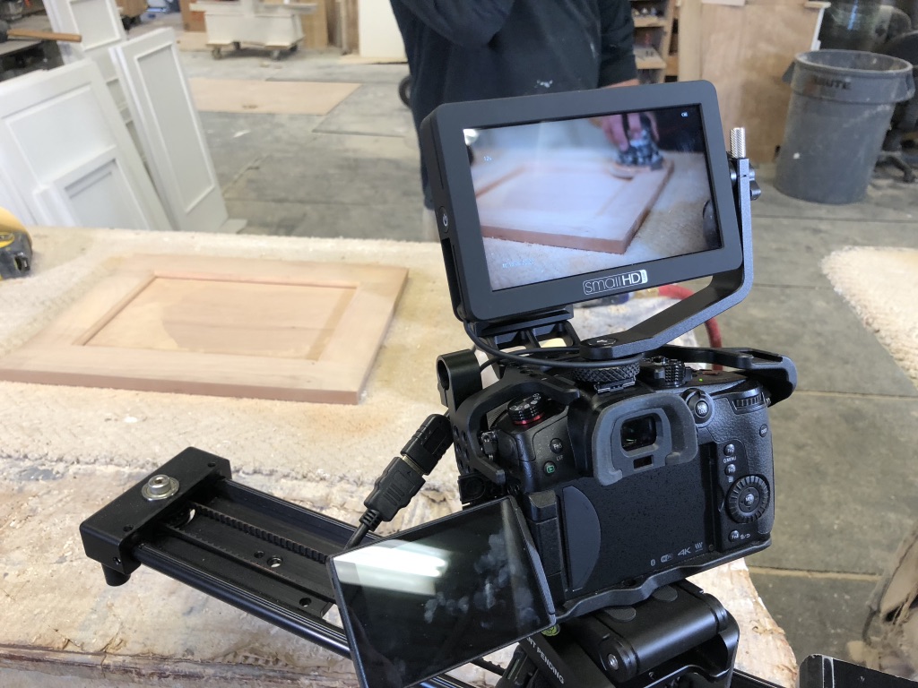
Lewis and Weldon wanted a commercial that didn’t look “local”. Sometimes “local” means including your kids, your dogs, a wealth of onscreen graphics with everything from discount percentages, scrolling text with hours, prices and specials, street addresses and your favorite lunch spot!* We stripped it all down and showed their work and craft in slow motion and let the video images entice the viewer. It’s how we love to create a :30 second commercial because usually “Less” really is MORE. So keep it simple. Show sweet imagery, and leave them with a simple website graphic where the viewer can find all the text they need.
* We don’t put favorite lunch spots in a company’s commercial.

![shoreline-logo@2x[1] shoreline-logo@2x[1]](https://shorelinemediapro.com/wp-content/uploads/2023/02/shoreline-logo@2x1.png)